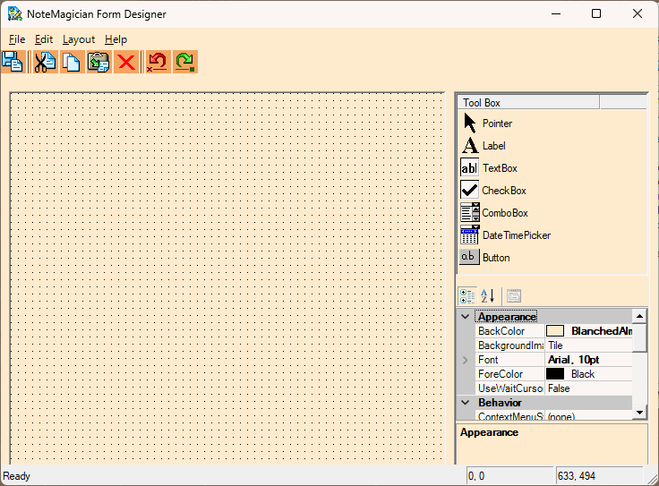
The Form Template Designer Dialog
This dialog is where you would create your own custom forms. Shown on the screen shot above is an example of some of the types of fields otherwise called controls that you can place on a form. This design tool may have a familiar look for those who use some other advance programs, or it may look very strange to you. Let us first discuss the sections of this screen:
DESIGNER SECTION |
DESCRIPTION |
|---|---|
Menu Bar |
As with most Windows applications, the forms designer also has a menu bar. Most of the options available on the menus can be found either by using toolbar buttons or pressing special key combinations. |
Toolbar |
The toolbar should have familiar functionality, and tooltips will be displayed when you pause the mouse over the icons to help in case the icons are unclear to you. |
Designer “Grid” |
The area with the dotted grid is where you build your custom template. When you create items based on your templates, they will look exactly as they appear in this designer grid. “What you see is what you get!” |
Tool Box |
The area on the top right is called the ToolBox. Within the toolbox are pictures of the field types you can place on your form. The top one, called Pointer, should be selected if you have inadvertently clicked on one of the other field types and want the cursor to revert back to a pointer. |
Property Grid |
In the lower right section you will find the information that further specifies options about your template. Each option has a name that should need no explanation. Each field, as well as the entire form, has properties that further define how that field or the form will be seen and/or used. |
Adding fields to your form template
To add a field to your form, simply left-click on the picture for that field, then move the mouse cursor over the Designer Grid, then left-click and hold the mouse as you draw the rectangle to be used for that field. You can click and hold the left button down when the mouse is on the field after it is added to drag the field elsewhere on the form. If you single left-click on a field, a sizing rectangle will allow you to grab various edges of the field’s rectangle to resize it. In addition, you can click on a field and use your cursor keys to move the field to another location. The field types are:
FIELD TYPE |
DESCRIPTION |
|---|---|
Button |
Buttons on NoteMagician forms currently have a very limited use. When pressed, they will send a message (text string contained in the Message property) to NoteMagician’s main program. The only message recognized is “Launch”. NoteMagician will make sure the button press came from a virtual item, then launch the program associated with the file type of the physical disk file associated with that virtual item. For example, if the Virtual Item pointed to a file named “Jingle Bells.mp3”, NoteMagician will launch your default music player when the form’s button is pressed. |
CheckBox |
A CheckBox consists of a box that can be checked, and the text to the right of the box that describes what you are checking. CheckBoxes always default to unchecked when new instances of form items are created. |
ComboBox |
ComboBoxes are the familiar control that allows you to select an option from a dropdown box by pressing the arrow next to reveal a fixed set of choices. Editable (see the property list below) ComboBoxes allow you to enter any text into the top line of the Combo Box in case you need to enter something other than one of the suggested strings. |
DateTimePicker |
This field allows you to select a date/time. Set the TimeOnly property to “True” to have the DateTimePicker show only a time value. |
Label |
Fixed text that cannot be changed by the user of this template. |
TextBox |
Text entry field. Depending on its properties, it may be used for textual or numerical information, and contain a single line or multiple lines. |
Properties for fields
Default values will be selected for the various field properties. When you are ready, you should highlight each field with a single left-click, and go to the Property Grid to change the various properties of that field. Most importantly, be sure to pick a meaningful name for your form. When you click anywhere on the Designer Grid that is not on top of a field, the properties of the form as a whole is shown. In particular, the Name property of the form will be the name given to this template that will be seen on NoteMagician’s Item menu.
The table below lists all the possible property names you will find in the Property Grid for various fields. Not all properties apply to each type of field Which field types they apply to are noted in the DESCRIPTION.
PROPERTY NAME |
DESCRIPTION |
|---|---|
AcceptsTab |
When text boxes are set to MultiLine, you can set AcceptsTab to true if you want to be able to insert tab characters in the text. Otherwise, the tab key at run time will advance to the next control on a form, if any. |
BackColor |
Background color of the field or form. When you click in this property area, a button with a down-arrow icon will appear. Click the button to open a dialog that allows you to choose from 3 different categories of colors: System color, Web-safe color, or a custom color. Custom color selection will launch a NoteMagician color selection dialog. |
DataType |
For text boxes, you can specify whether the allowed data to be entered by into an item based on this template for this field is to be text, integer, or decimal (decimal point allowed.) |
DrawGrid |
This applies only to the Form itself. Setting this to True will display the dotted grid to help you align controls in your form. The grid will not, however, be seen when you create and modify items based on this form template. |
Editable |
Applying only to Combo Box fields (drop-down boxes), making them editable means that you don’t have to select an item from the dropdown list. At run time, you can actually type any string of your choice in the text area of the drop-down box. |
Font |
Applying to all fields, this property sets the font and style to be used. You can expand the Font property by pressing the arrow button next to the word Font to change one of several font style settings. Alternatively, pressing the ellipses (“…”) button next to the font description will open a font selection dialog. NOTE: Please avoid changing the GdiCharSet and GdiVerticalFont properties within the font. |
ForeColor |
Select the text Foreground color of an individual field or the default foreground color for entire form. When you click in this property area, a button with a down-arrow icon will appear. Click the button to open a dialog that allows you to choose from 3 different categories of colors: System color, Web-safe color, or a custom color. Custom color selection will launch a NoteMagician color selection dialog. |
GridSize |
This property applies only to the form as a whole in design mode. Enter two numbers for the horizontal and vertical number of screen pixels between dots in the grid. Smaller grid sizes make it easier to accurately line fields up, but are harder to see. If you do not turn SnapToGrid to True, the GridSize is only for your own visual purposes. |
Items |
For Combo-box fields to be useful, you must enter a list of names that will appear in the drop-down when the down arrow is pressed during form data entry. Click on Items to reveal a button you can press to bring up a dialog designed to let you enter a list of items. Each item you add will have one additional property, Value, that is simply the text that will appear in the drop-down. |
Location |
The x/y position, in pixels, relative to the top left of the Designer Grid (and therefore top left of the form when shown in the Item Pane.) Enter the two numbers, separated by a comma, with the first number being the number of pixels to the right of the left edge of the form and the second number being the number of pixels below the top edge of the form. These numbers are automatically set when you place and/or move a field in the designer grid. |
LowerLimit |
For TextBox fields, the LowerLimit specifies either the fewest number of characters that the user of this form may enter into this field (text DataType) or the smallest numerical value for numerical DataType’s. |
Mutliline |
For TextBox fields, specifies if the box can be larger than one line in height. |
Name |
The Name of a field should be something that will make sense to you when you go back and edit this form. This name is saved in the form template. You should usually create names like “ComboStatus” for comboboxes or “TextName” for a TextBox. The Form Designer will create default names every time you add a field to a form. Note: The Name property of the overall form will be the name displayed on NoteMagician’s menus for this template. So choose something that can easily be recognized as the purpose of the form. Certain characters (such as *, ?, :, etc) will not be permitted in form names. |
Precision |
Number of places to the right of the decimal place allowed for TextBox fields that have the Decimal DataType. |
Size |
The width and height of the field, measured in pixels. Enter two numbers, separated by a comma. The width is the first number. The Size is set automatically when you create and or resize the field on your form. |
SnapToGrid |
Applying to the form in Design mode, set this field if you want the Designer to choose the closest vertical and horizontal grid dot for the upper left corner of fields added to the form. This helps make it easy to line field up. |
TabIndex |
The TabIndex property helps determine what order the fields will be accessed as the user presses the Tab key to go from field to field. The Designer will pick some number as you add fields. However, it is a good idea to check the numbering when you are satisfied with your form layout so that data entry into that form will be convenient for the user. |
Text |
For Label, CheckBox and TextBox fields, this will be the string of data that you will see when an item is created based on this form. |
UpperLimit |
For TextBox fields, the UpperLimit specifies either the largest number of characters that the user of this form may enter into this field (text DataType) or the largest numerical value for numerical DataType’s. |
Aligning and sizing your fields
When you want assistance lining up your fields to make a good looking form, you can use the Layout menu shown below:
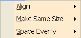
There are three types of operations you may use to assist you in making your layout look the way you like. All items on this menu assume you have at least two form fields selected that you wish to perform some operation on. To select multiple fields you can:
- Left-click your mouse and drag a rectangle that fully encloses all the fields you want to select;
- Left-click on a field, then press <Ctrl> while simultaneously left-clicking on another field.
When performing operations such as making fields the same size, the LAST field selected will be the field that others will be sized or aligned to. The categories for layout are:
MENU ITEM |
DESCRIPTION |
|---|---|
Align |
Provides 6 options for aligning fields. In the horizontal direction you can align the left, right or horizontal center. In the vertical direction you can align the top, bottom or vertical center. |
Make Same Size |
Allows you to resize fields to the last one selected in its Width, Height or Both. |
Space Evenly |
Divide the space, Across or Up and Down, evenly placing the fields leaving equal room on both sides. |